C-PRISM
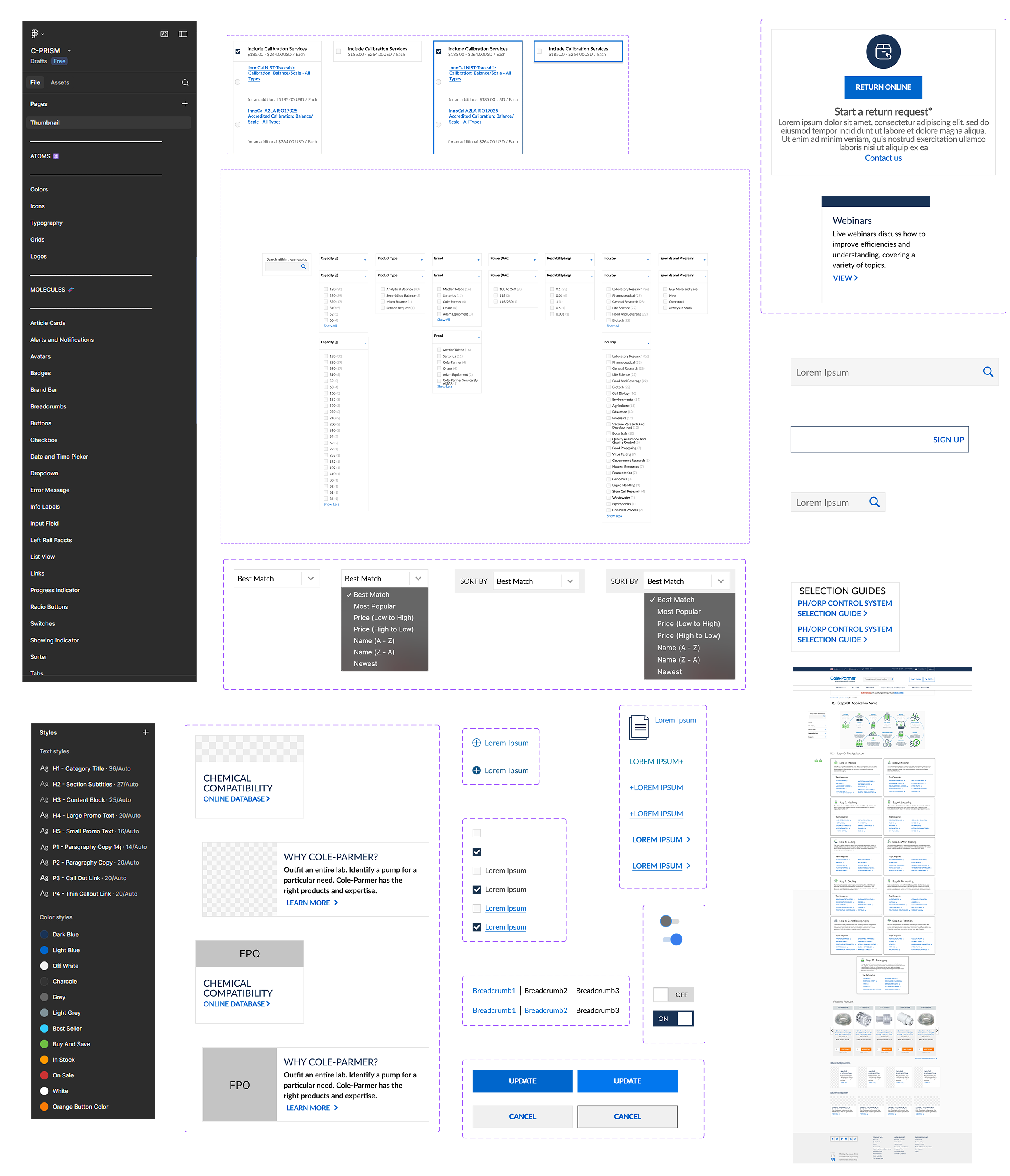
Cole-Parmer Resource for Interface & System Management
Project Scope
Context
Design work was created in Adobe tools without a formal design system or shared component library. As the only team member with Figma experience, the transition to Figma became an opportunity to establish the organization’s first centralized design system. The initiative aimed to modernize workflows, standardize UI patterns, and create a scalable foundation for continued site growth.
Problem
Without a structured design system, components were recreated across projects, spacing and typography lacked consistency, and design-to-development handoff varied between initiatives. As the website expanded, these inefficiencies increased production time and made maintaining visual and functional consistency more difficult.
Constraints
Active projects required ongoing design support during the migration.
Existing live website patterns needed to be preserved.
Limited development bandwidth required phased implementation.
Team members required onboarding and guidance in new Figma workflows.
Goals
Lead the migration from Adobe tools to Figma.
Establish the organization’s first formal design system.
Standardize reusable UI components and interaction patterns.
Improve design-to-development consistency.
Reduce repetitive UX production work.
My Responsibilities
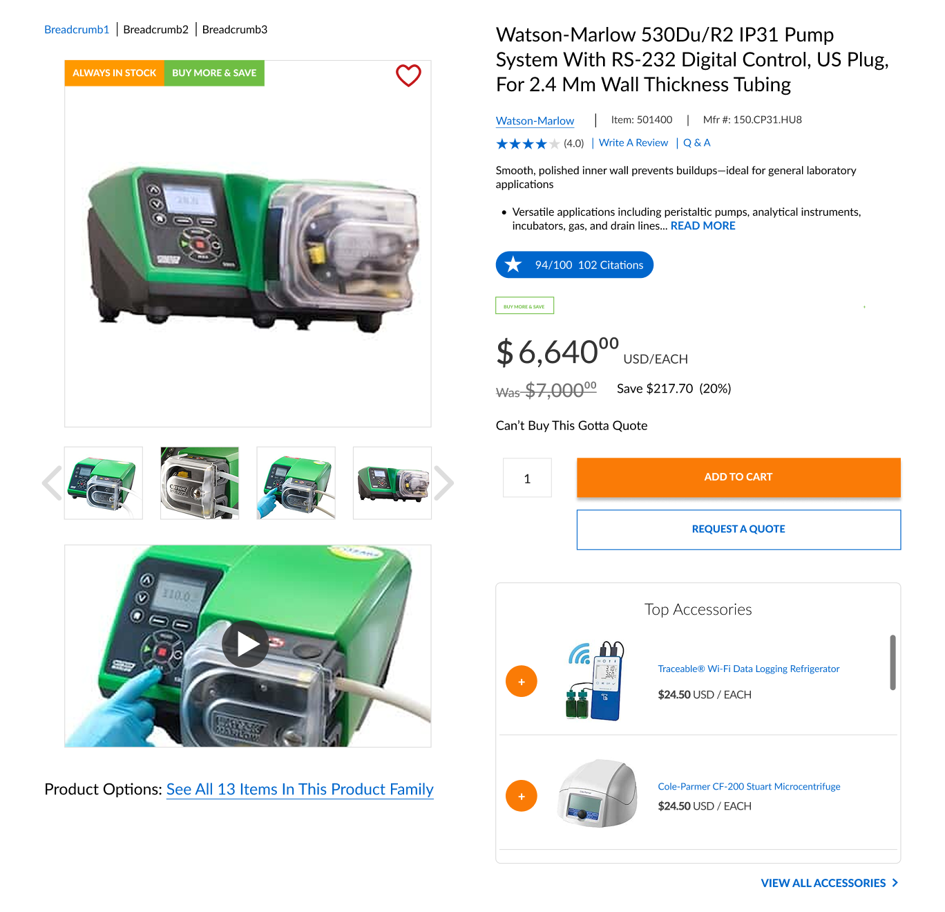
Led the end-to-end redesign of the standardized product page template, from research and wireframing through final implementation. Developed high-fidelity interactive prototypes in Figma and translated them into production using HTML, CSS, JavaScript, and Razor. Self-taught Razor and advanced JavaScript to directly support development, collaborating in extended coding sessions with IT to ensure design fidelity and on-time delivery. Architected and implemented cross-sell, upsell, and product comparison functionality powered by Bloomreach AI recommendations to enhance product discovery and increase average order value.
The Result
The implementation of a centralized design system reduced UX production time by 30% through reusable component workflows. Cross-page visual and interaction consistency improved significantly, and design-to-development handoff became more streamlined. The new system established a scalable foundation that supports ongoing feature expansion and long-term site growth.
Research
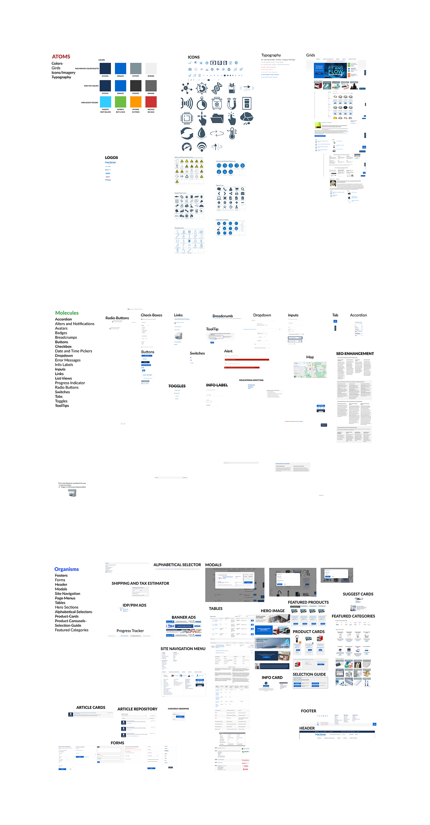
Research began with an internal audit of existing UI components across Adobe files and live production pages. Repeated patterns were cataloged and evaluated for consistency in spacing, typography, color usage, and interaction behavior. This audit revealed redundancies, inconsistent naming conventions, and variations of similar components that had evolved without shared standards.
To establish a scalable foundation, the system architecture was informed by Brad Frost’s Atomic Design methodology. Components were analyzed and restructured from foundational elements (atoms) to composite patterns (molecules and organisms), ensuring modularity, reusability, and predictable behavior across templates. This framework provided a structured approach to organizing the growing interface.
Collaboration with engineering further shaped the system’s structure. Existing frontend patterns and constraints were reviewed to align Figma components with production logic, reducing handoff ambiguity and improving implementation accuracy. The combined research informed a standardized component library designed to support scalability, consistency, and long-term maintainability.
The Design Strategy
Following the component audit, the system was structured around principles of modularity, scalability, and consistency. Brad Frost’s Atomic Design methodology informed the architectural foundation, organizing the interface into foundational elements, reusable component groupings, and larger template-level patterns. This structured approach ensured that UI decisions could scale predictably as new features and pages were introduced.
Foundational atoms including typography styles, spacing units, and iconography served as the base layer of the system. These elements combined into reusable molecules such as buttons, input fields, badges, and pricing modules, which were then assembled into larger organisms including navigation systems, product cards, and content blocks. Clear naming conventions and variant logic were implemented to ensure components remained flexible yet controlled.
Variants and auto layout in Figma were leveraged to reduce redundancy while maintaining adaptability across use cases. By aligning the component structure closely with frontend implementation patterns, the system improved handoff clarity and reduced production inconsistencies.
Adoption & Implementation
The transition to Figma and the introduction of a formal design system required phased rollout alongside active design projects. Legacy components were systematically rebuilt within the new framework while continuing to support ongoing feature releases and campaign work.
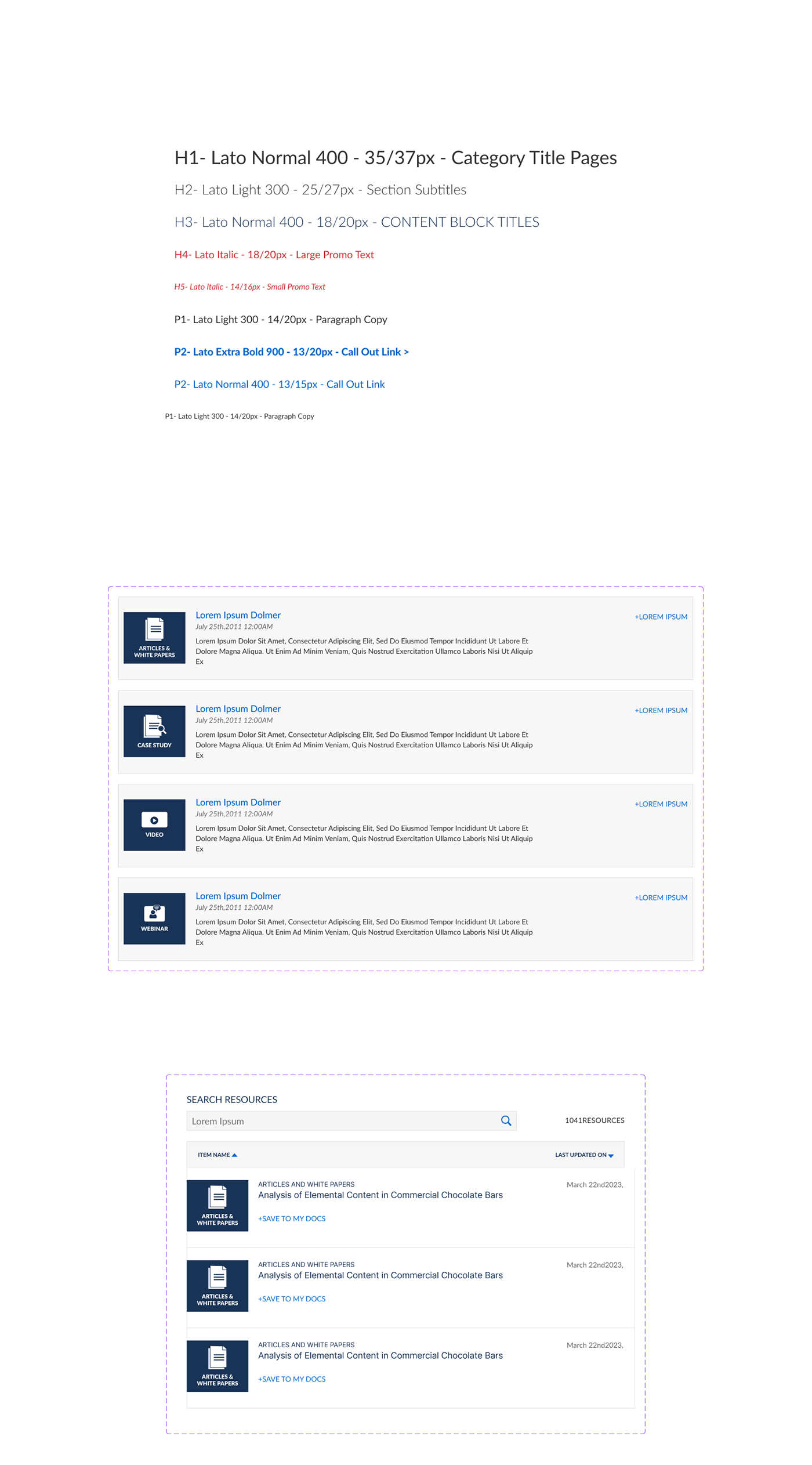
Documentation and usage guidelines were created to establish clear standards for naming conventions, spacing systems, typography, and component variants. Structured onboarding support enabled consistent adoption across the team, ensuring new projects were built within the standardized system.
Close collaboration with engineering aligned Figma components with frontend implementation patterns, reducing ambiguity during handoff and improving production accuracy. As adoption increased, the system became the foundation for all new design work, reinforcing consistency and accelerating delivery timelines.
Key Take Aways
The implementation of the design system significantly improved design-to-development consistency and reduced the time required to produce high-fidelity mockups. Standardized components and reusable patterns accelerated workflow efficiency, contributing to a measurable 30% reduction in UX production time.
For the first time, the development team worked from pixel-accurate interactive prototypes, reducing ambiguity during handoff and minimizing implementation discrepancies. This alignment strengthened cross-functional collaboration and improved overall delivery confidence.
Ongoing governance of the system ensured that new components were thoughtfully integrated into the existing framework. This maintained visual familiarity across the product while still allowing flexibility for innovation and evolving interface patterns. The result was a scalable, consistent foundation that continues to support long-term growth.
Check Out Some More Of My Work

Optimizing Enterprise Navigation & Search
Redesigned enterprise navigation and search to improve usability, account visibility, and product discovery.
C-PRISM
Cole-Parmer Resource for Interface & System Management
B2B Product Page Redesign
Restructured key product information to support faster decision-making and a more intuitive buying experience.
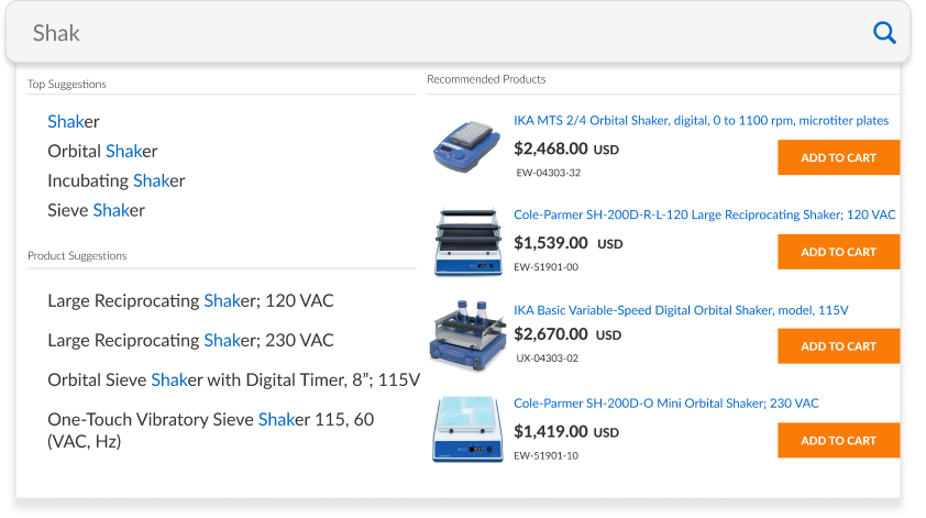
Visual Search for Complex Catalogs
Created a streamlined visual search flow for navigating large, high-SKU catalogs.
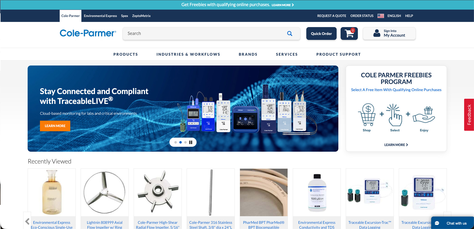
Homepage Redesign
Modernized a legacy homepage to improve clarity, visual hierarchy, and conversion performance for a high-traffic B2B website.

Augmented Reality Interface for NASA
Developed an AR interface prototype for the NASA SUITS competition.