B2B Product Page Redesign
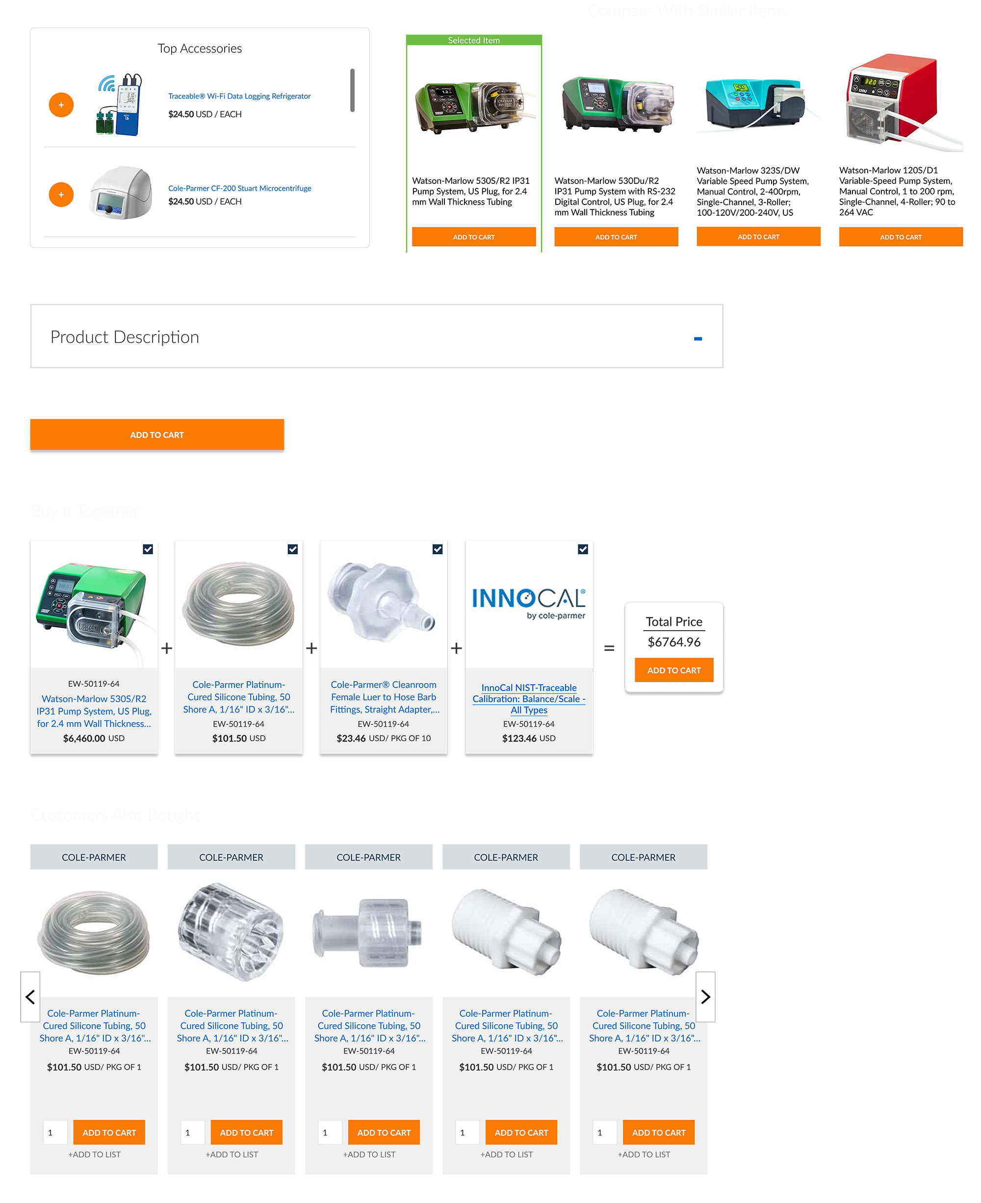
Modernized a legacy product page to improve clarity, scalability, and conversion performance within a complex B2B catalog.
Project Scope
Context
The standardized product page template served as a primary revenue driver, supporting high-volume B2B transactions and complex product configurations. However, the experience was built on an outdated visual system that no longer aligned with modern usability expectations or the growing scale of the catalog.
Problem
A rigid three-column layout clumped critical product information into dense sections, making the page difficult to scan and compare. As product offerings expanded, the structure limited scalability, reduced clarity, and created friction in the buying process.
Constraints
Design required to remain within a fixed 1120px framework.
Extremely tight project timeline.
Limited development resources (one IT partner).
Required alignment with existing backend architecture and Razor framework.
Goals
Improve visual hierarchy and scannability to support faster decision-making.
Create a scalable page structure that could support expanding product complexity.
Enhance product discovery through cross-sell, upsell, and comparison functionality.
Strengthen overall conversion performance while working within technical constraints.
My Responsibilities
Led the end-to-end redesign of the standardized product page template, from research and wireframing through final implementation. Developed high-fidelity interactive prototypes in Figma and translated them into production using HTML, CSS, JavaScript, and Razor. Self-taught Razor and advanced JavaScript to directly support development, collaborating in extended coding sessions with IT to ensure design fidelity and on-time delivery. Architected and implemented cross-sell, upsell, and product comparison functionality powered by Bloomreach AI recommendations to enhance product discovery and increase average order value.
The Result
The redesigned product page established a scalable foundation for the catalog while significantly improving information hierarchy and scannability. AI-powered cross-sell, upsell, and comparison functionality increased product discovery and purchasing confidence. The redesign contributed to an 8% increase in revenue, directly improving performance on one of the site’s highest-impact conversion pages.
Research
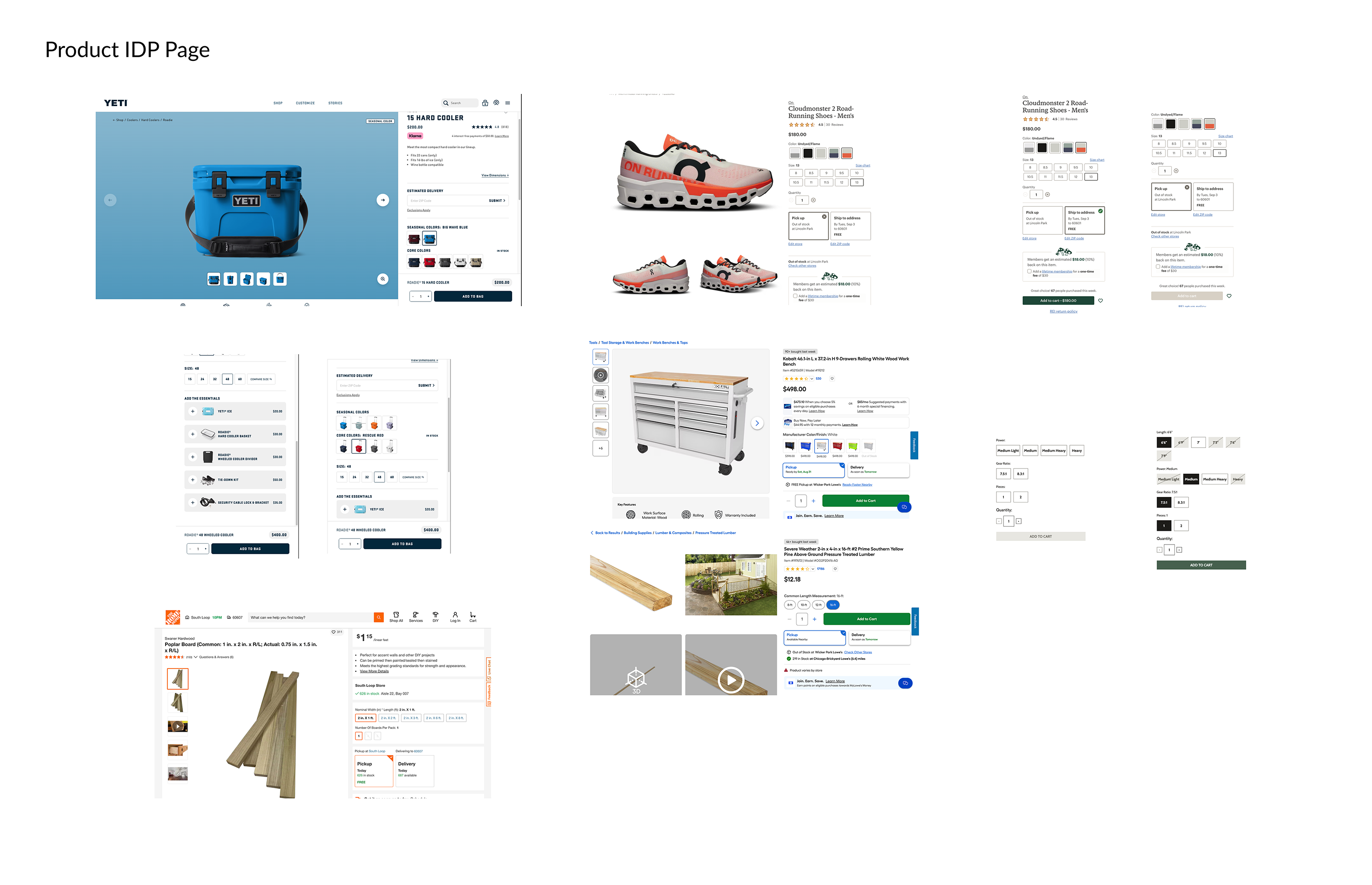
Research began with a competitive and comparative analysis of direct competitors and high-performing eCommerce retailers. Product pages were broken down to evaluate layout structure, information hierarchy, pricing visibility, recommendation placement, and comparison workflows to understand what supported clarity and purchasing confidence at scale.
Behavioral insights were gathered using Glassbox session recordings, heatmaps, and interaction data to observe how users navigated the existing product page. These findings revealed friction points, scroll hesitation, overlooked specifications, and repeated interaction patterns caused by the legacy three-column layout.
Survey feedback further identified key pain points, including difficulty comparing products, locating critical specifications, and understanding configuration options. Combined, these insights informed a restructuring of the page around improved hierarchy, clearer information grouping, and stronger decision support.
The Design Process
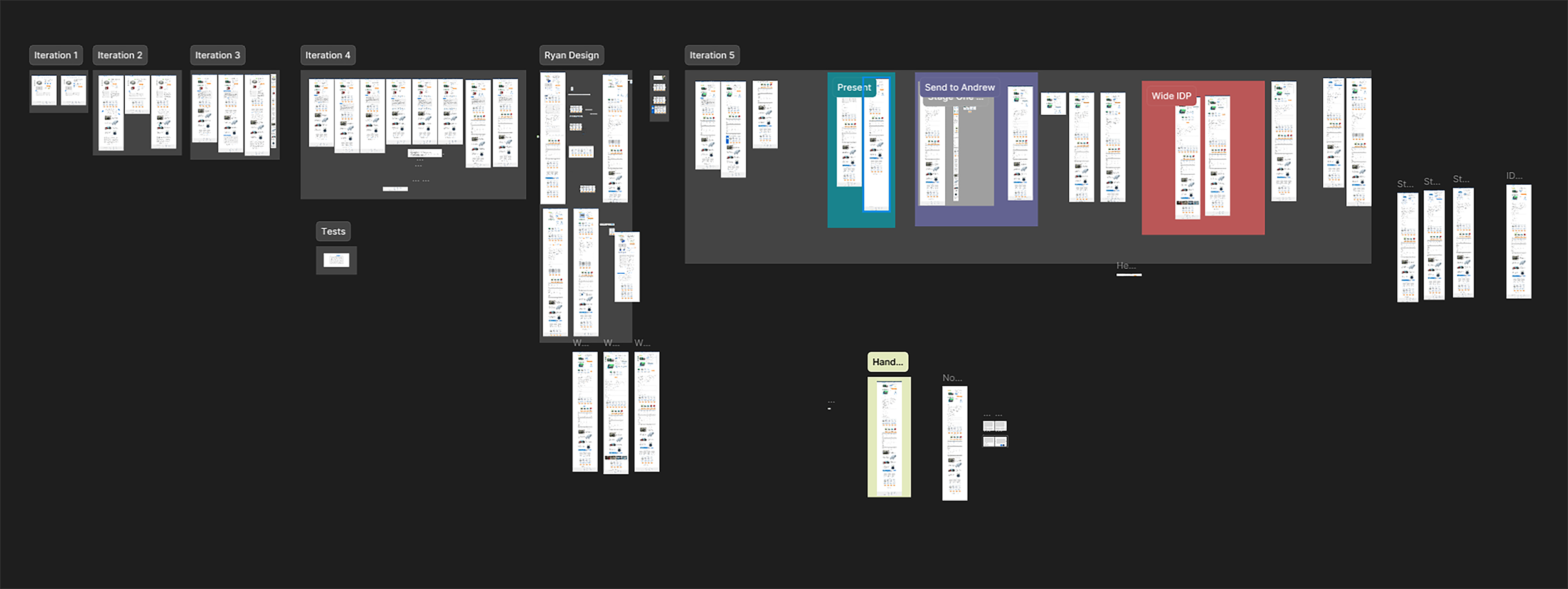
The design process began in Figma, translating insights gathered from competitive analysis and user surveys into structured layout explorations. Multiple high-fidelity iterations were developed to test hierarchy improvements, information grouping, and new interaction patterns while remaining within the 1120px framework.
Prototypes were used to explore innovative integrations of Bloomreach AI within the product detail page, including strategic placement of cross-sell, upsell, and comparison modules to enhance product discovery and decision support. These iterations were presented to leadership to align on direction and business impact.
Once a final direction was established, a refined high-fidelity prototype was created for internal testing and usability validation. The approved design was then handed off to IT and built within a staging environment, allowing for iterative refinement and alignment between design and development prior to launch.
So What Changed?
Above the Fold
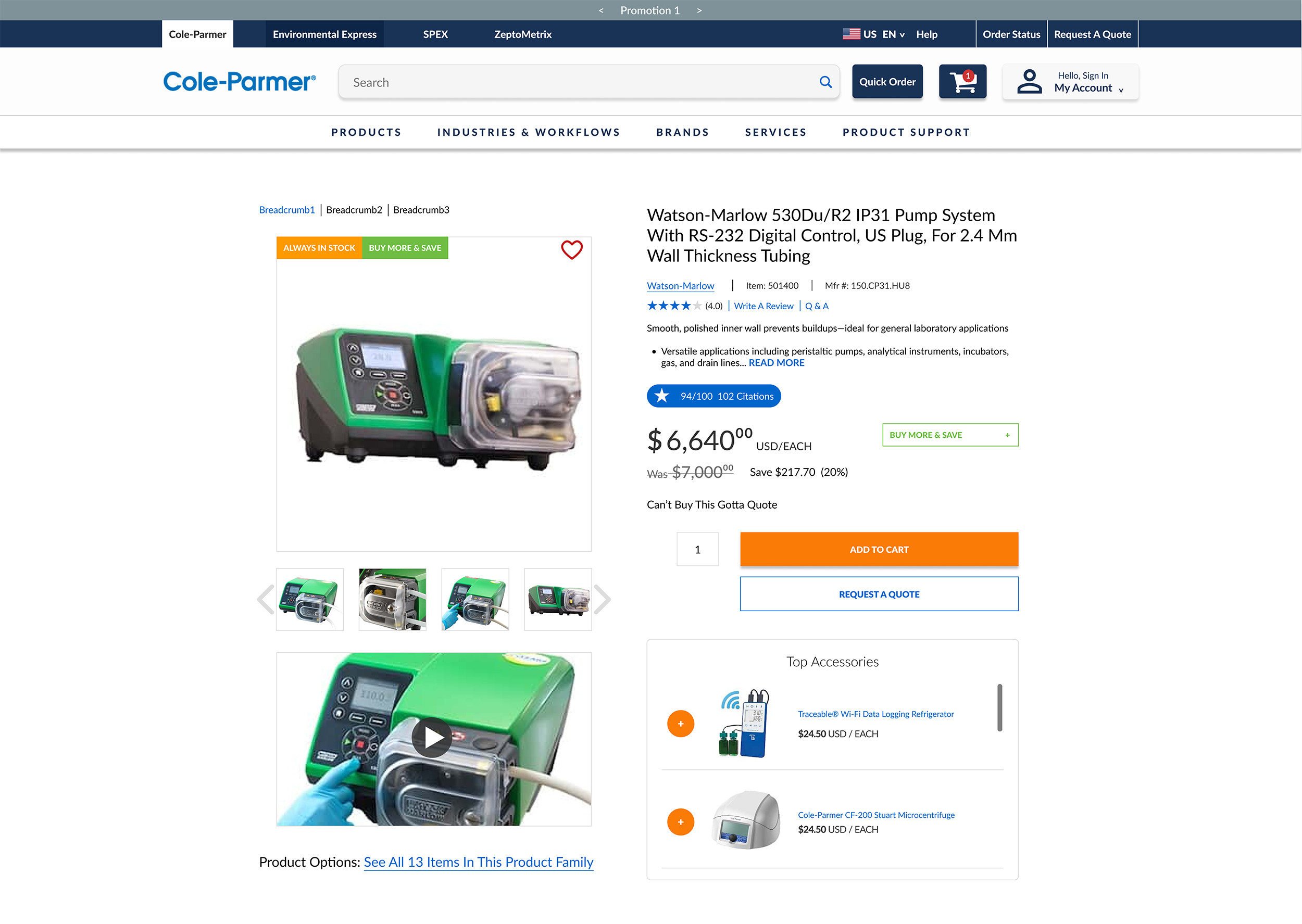
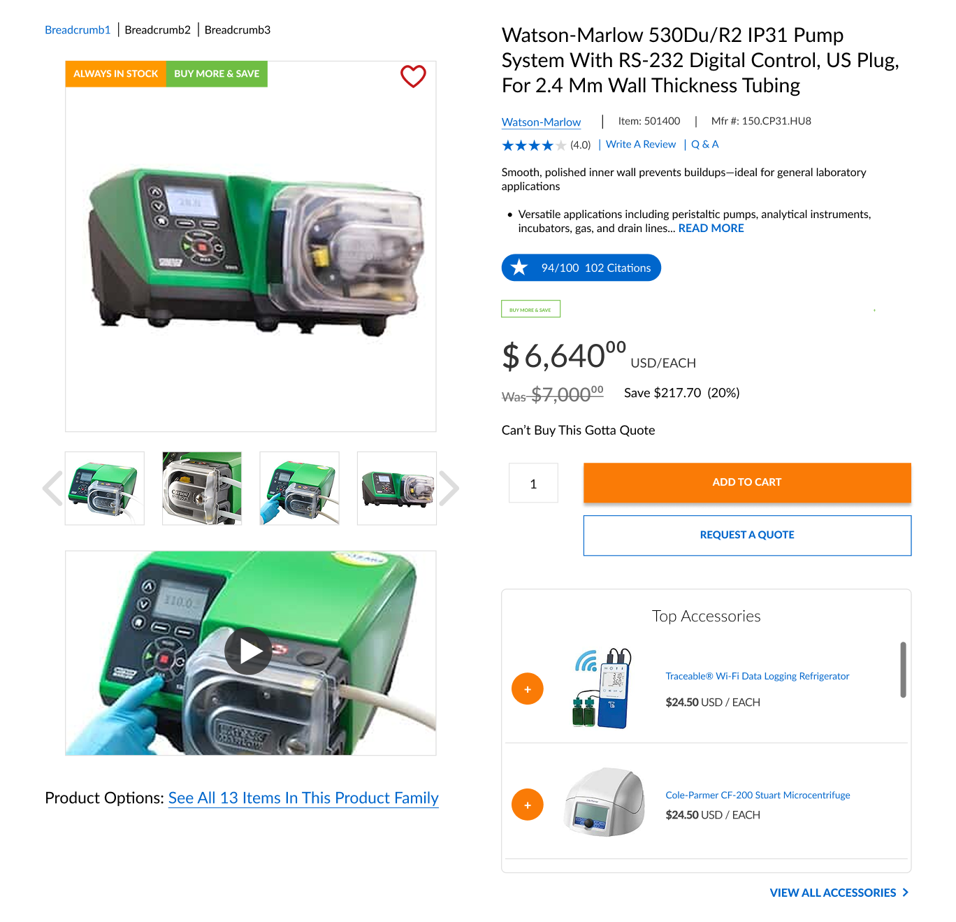
Increased the primary product image from 300px to 465px to improve visual prominence and allow users to better evaluate product details. Transitioned from a rigid three-column structure to a two-column layout, creating clearer hierarchy and introducing jump links to guide users efficiently to key sections of the page.
Expanded the width of the Add to Cart button by 40% to increase visibility and reinforce the primary conversion action. Introduced a top-level accessories module with vertical scroll functionality to surface complementary products earlier in the decision-making process.
Added a dedicated video module to support multiple product demonstrations and educational content within the page. Redesigned the “Buy More, Save More” experience to improve clarity, simplify tiered pricing comprehension, and align it visually with the updated system for a more cohesive experience.
Mid-Page Enhancements
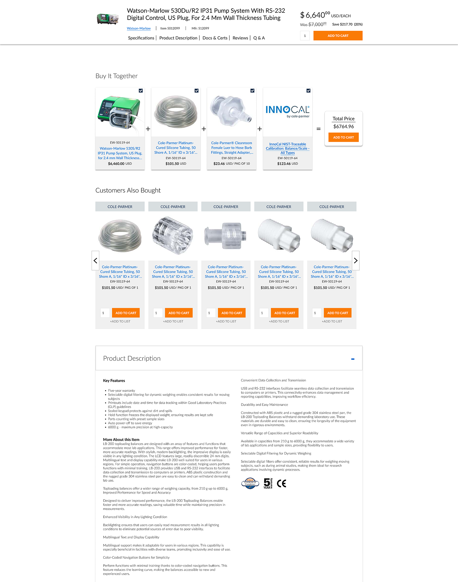
Below the fold, the sticky header was redesigned to include jump links that anchor users to key product sections, improving navigation efficiency across long-form content. The sticky header also gained persistent Add to Cart functionality, allowing users to convert at any point without needing to scroll back to the top of the page.
Two AI-powered recommendation modules were introduced using Bloomreach. A “Buy It Together” bundler leveraged co-purchase behavior to surface frequently purchased combinations, while a “Customers Also Bought” scroller dynamically recommended related products based on behavioral data. Together, these modules increased product discovery and generated approximately $70K in additional monthly revenue.
Product information was restructured into expandable drawer components, allowing users to open and close sections based on relevance. This reduced perceived page length, minimized unnecessary scrolling, and improved content digestibility without removing critical technical information.
Bottom of The Page
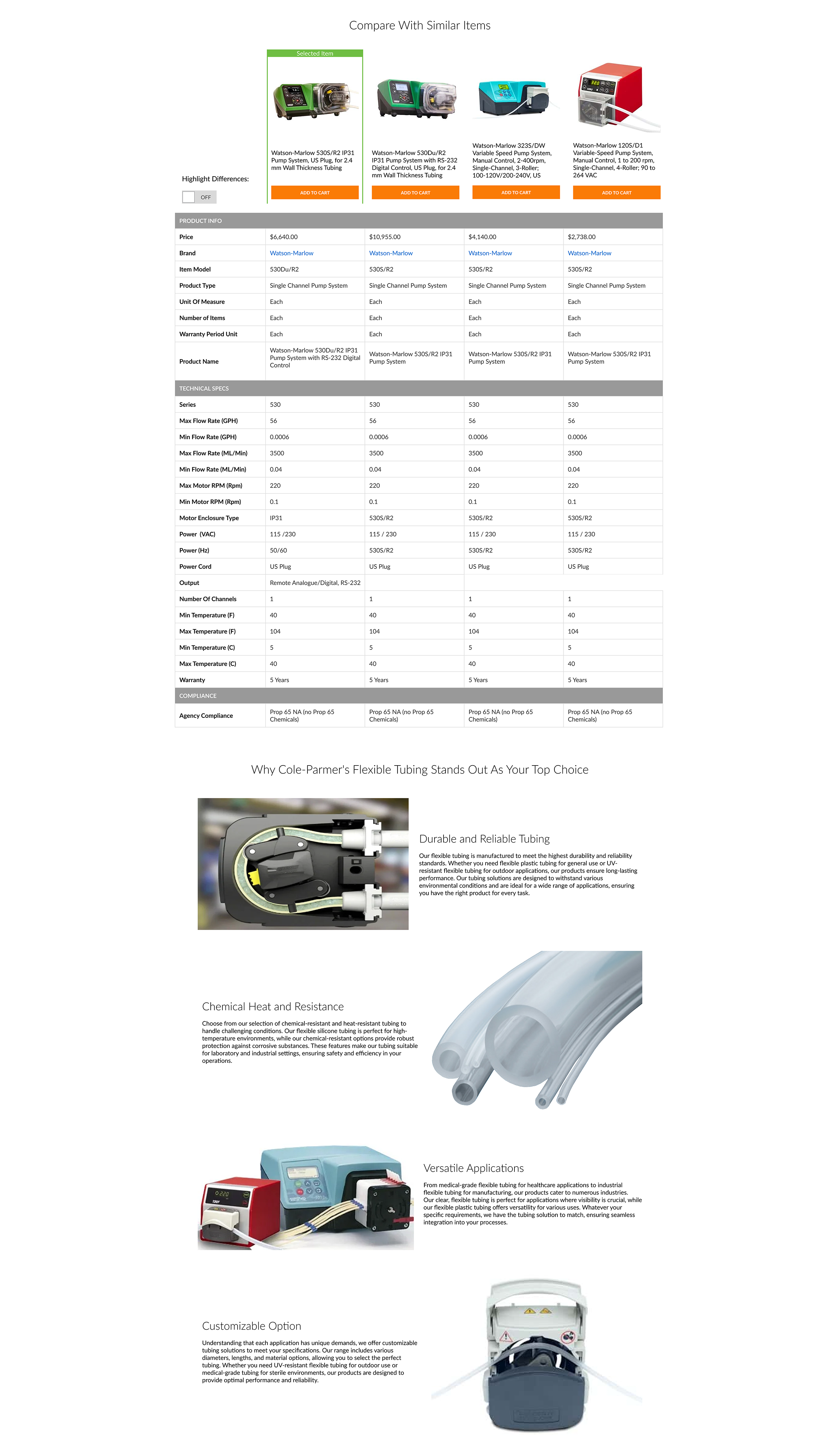
A product comparison module was introduced to allow users to evaluate specifications side by side against similar products. This feature supported informed decision-making by clearly illustrating differences in performance, configuration, and value, helping users assess how a product stacks up against relevant alternatives.
The comparison experience increased purchasing confidence and contributed approximately $20K in additional monthly revenue by keeping users engaged within the product ecosystem rather than exiting to compare externally.
A flexible rich text section was added beneath the comparison module to support SEO-driven marketing content. This area enabled targeted keyword optimization to improve search rankings while also providing persuasive product messaging to reinforce value and influence purchase decisions.
The Development Work
The final design was implemented directly into production using HTML, CSS, JavaScript, and Razor, with a strong emphasis on preserving usability, hierarchy, and interaction intent throughout development. Technical decisions were evaluated through a user-centered lens to ensure the experience remained intuitive and performant.
Close collaboration with IT supported iterative refinement during build, allowing layout behavior, spacing, and interaction details to be validated and adjusted in real time. This partnership helped balance design goals with backend constraints while maintaining consistency across responsive breakpoints.
Bloomreach-powered recommendation and comparison components were integrated in a way that supported, rather than distracted from, the primary purchase flow. Attention was given to content prioritization, progressive disclosure, and interaction timing to ensure AI-driven features enhanced decision-making without increasing cognitive load.
Bridging design and implementation strengthened the final experience by reducing handoff friction, accelerating iteration, and ensuring the shipped solution reflected both user needs and technical realities.
Key Take Aways
This project reinforced that meaningful UX improvements often come from restructuring information rather than removing complexity. Preserving depth while improving hierarchy and scannability allowed users to make confident decisions without sacrificing critical product details.
Grounding design decisions in a combination of behavioral data, user feedback, and business objectives created alignment across stakeholders and accelerated decision-making. Clear evidence helped move the project forward despite tight timelines and technical constraints.
Working directly within development constraints highlighted the value of early collaboration with engineering. Understanding backend limitations and implementation realities led to more practical design solutions and reduced friction during build and launch.
Finally, integrating AI-driven features demonstrated that advanced functionality is most effective when thoughtfully embedded into the user journey. When recommendations and comparison tools were designed to support decision-making, they delivered measurable business impact without compromising usability.
Check Out Some More Of My Work

Optimizing Enterprise Navigation & Search
Redesigned enterprise navigation and search to improve usability, account visibility, and product discovery.
C-PRISM
Cole-Parmer Resource for Interface & System Management
B2B Product Page Redesign
Restructured key product information to support faster decision-making and a more intuitive buying experience.
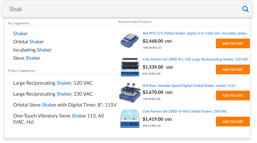
Visual Search for Complex Catalogs
Created a streamlined visual search flow for navigating large, high-SKU catalogs.
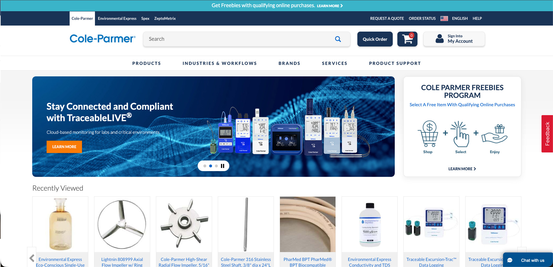
Homepage Redesign
Modernized a legacy homepage to improve clarity, visual hierarchy, and conversion performance for a high-traffic B2B website.

Augmented Reality Interface for NASA
Developed an AR interface prototype for the NASA SUITS competition.