B2B Homepage Redesign
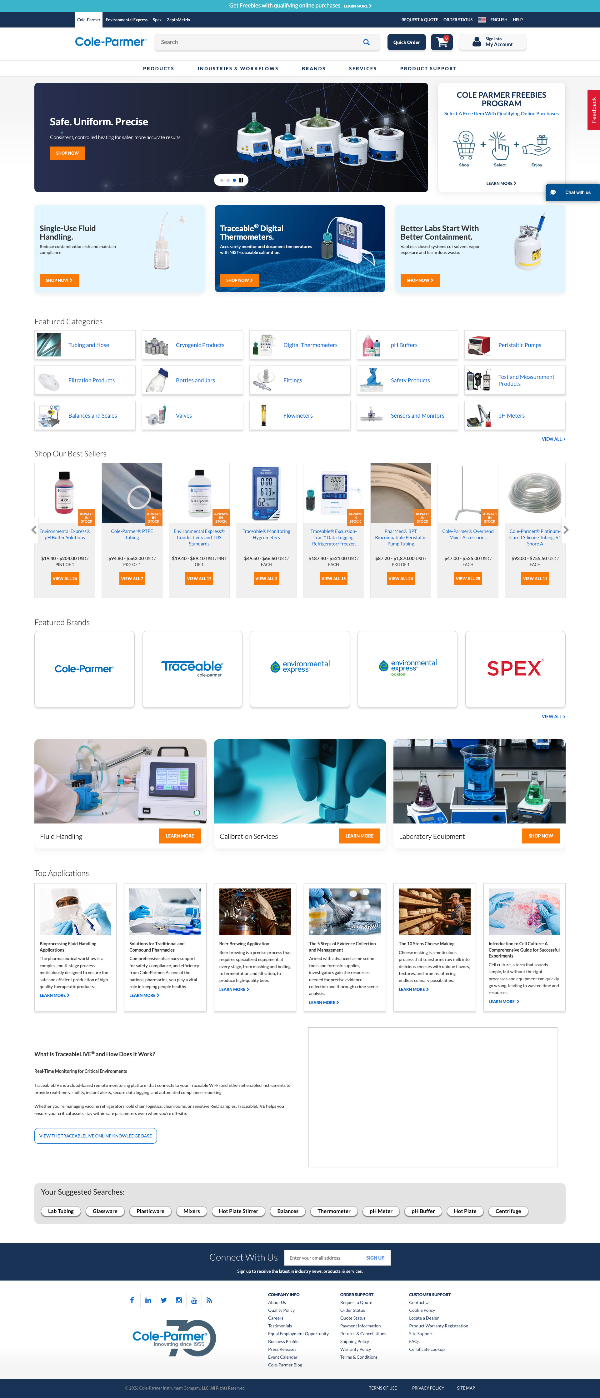
Modernized a legacy homepage to improve clarity, visual hierarchy, and conversion performance for a high-traffic B2B website.
Project Scope
Context
The homepage served as the primary entry point for a high-traffic B2B website, setting the tone for the entire buyer journey. However, the experience had not been redesigned in nearly a decade, leaving it built on an outdated visual system that no longer aligned with modern usability expectations or the company's current product offering.
Problem
A dense, cluttered layout made it difficult for buyers to quickly understand the company's value proposition or know where to focus. Poor visual hierarchy created friction early in the buying journey, reducing the homepage's effectiveness as a conversion and lead generation tool.
Constraints
Design required to remain within a fixed layout framework.
Extremely tight project timeline.
Limited development resources (one IT partner).
Required alignment with existing backend architecture and Razor framework.
Goals
Modernize the visual design to meet current usability expectations.
Improve visual hierarchy and scannability to support faster decision-making
Strengthen the homepage's value proposition for B2B buyers.
Improve overall conversion and lead generation performance.
My Responsibilities
Led the end-to-end redesign of the company homepage, from research and wireframing through final implementation. Developed high-fidelity interactive prototypes in Figma and translated them into production using HTML, CSS, JavaScript, and Razor. Collaborated closely with an IT partner to ensure design fidelity and on-time delivery within a complex CMS environment.
The Result
The redesign produced a significant visual and structural improvement over an experience that had remained unchanged for nearly ten years. Stakeholder and leadership alignment was strong throughout, with clear organizational confidence in the final direction. The project successfully addressed a long-standing deficiency in the company's digital presence, delivering a homepage that accurately represents the scale and credibility of the business. Conversion and lead generation metrics are currently being measured as the page accumulates performance data post-launch.
Research
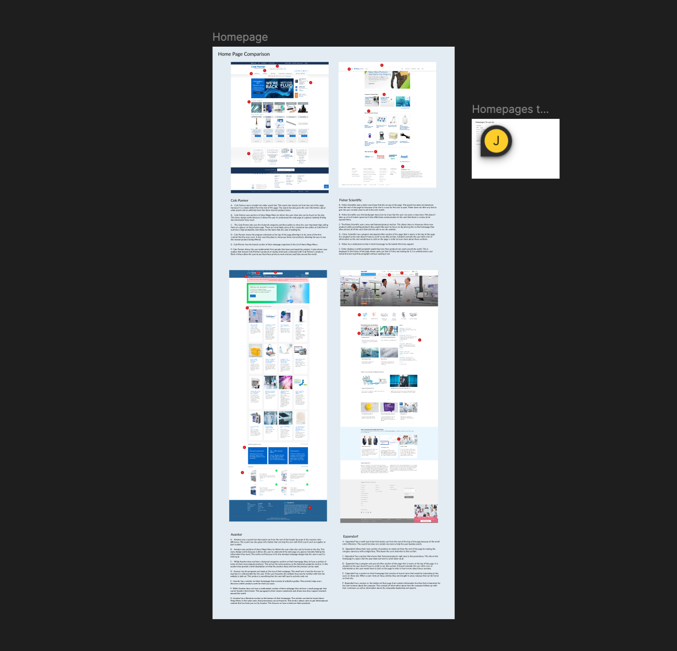
Research began with a competitive and comparative analysis of direct competitors, best-in-class B2B websites, high-performing eCommerce sites, and industry-specific examples. Homepages were evaluated across layout structure, visual hierarchy, value proposition clarity, content organization, and call to action placement to establish a clear benchmark for what a modern, high-performing homepage looks like.
Behavioral insights were gathered using Glassbox session recordings and heatmaps to observe how users were actually interacting with the existing homepage. These findings revealed low scroll depth, weak hierarchy, and a value proposition that wasn't resonating — patterns that had likely gone unaddressed for years. Together, the competitive analysis and behavioral data made it clear just how far the homepage had fallen behind, and provided a strong, evidence-based foundation for the redesign direction.
The Design Process
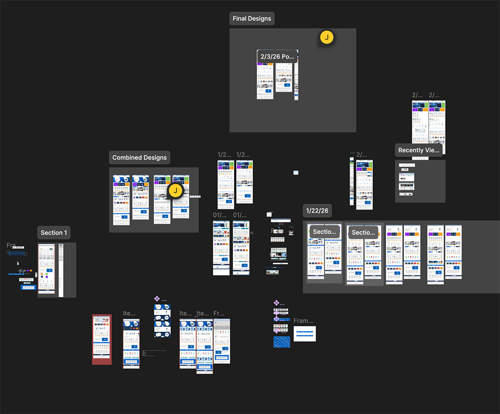
The design process began in Figma, translating insights from competitive analysis and behavioral data into structured layout explorations. Multiple high-fidelity iterations were developed to test hierarchy improvements, content reorganization, and stronger value proposition positioning, all while working within the fixed layout framework.
Iterations were presented to leadership to align on direction and ensure the redesign addressed both user needs and business objectives. Once a clear direction was established, a refined high-fidelity prototype was developed for internal testing and usability validation. The approved design was then handed off to IT and built within a staging environment, allowing for iterative refinement and close alignment between design and development prior to launch.
Once a final direction was established, a refined high-fidelity prototype was created for internal testing and usability validation. The approved design was then handed off to IT and built within a staging environment, allowing for iterative refinement and alignment between design and development prior to launch.
So What Changed?
Above the Fold
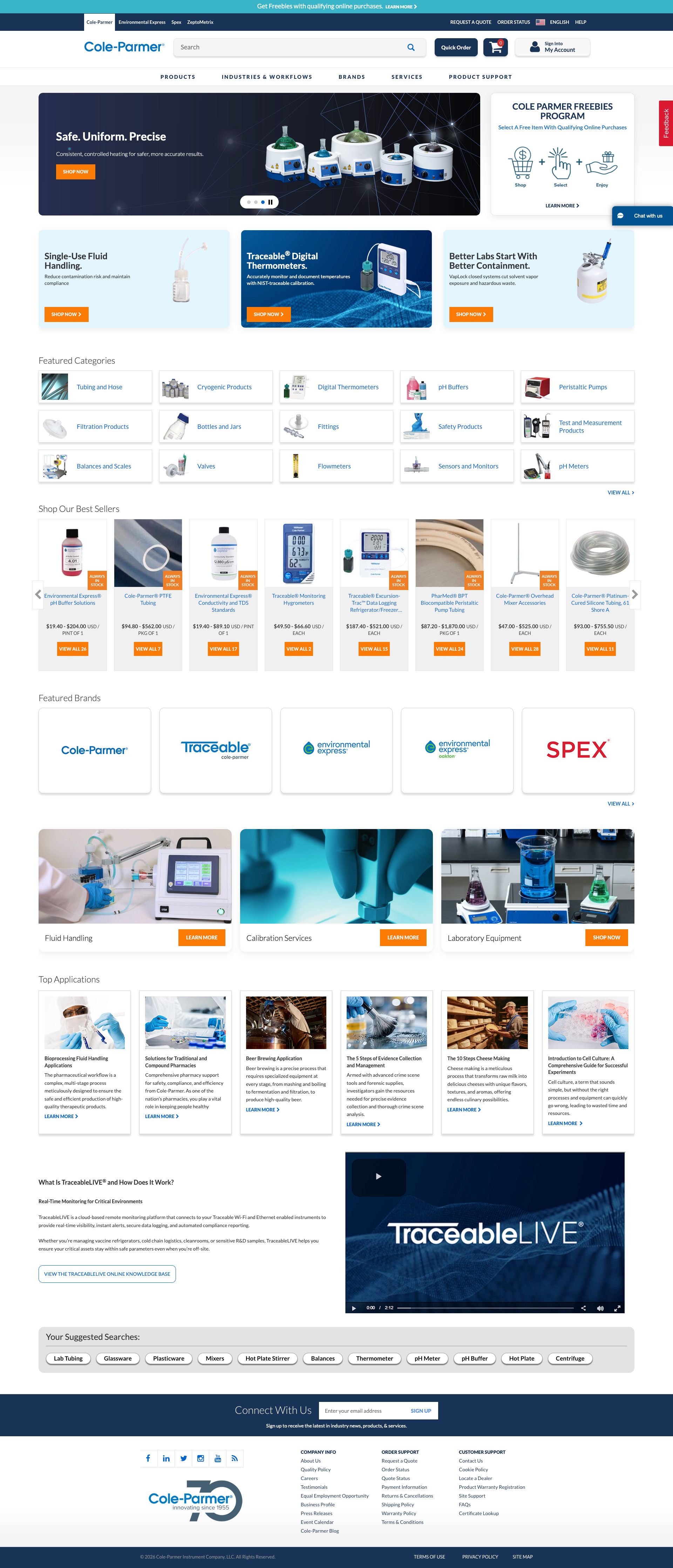
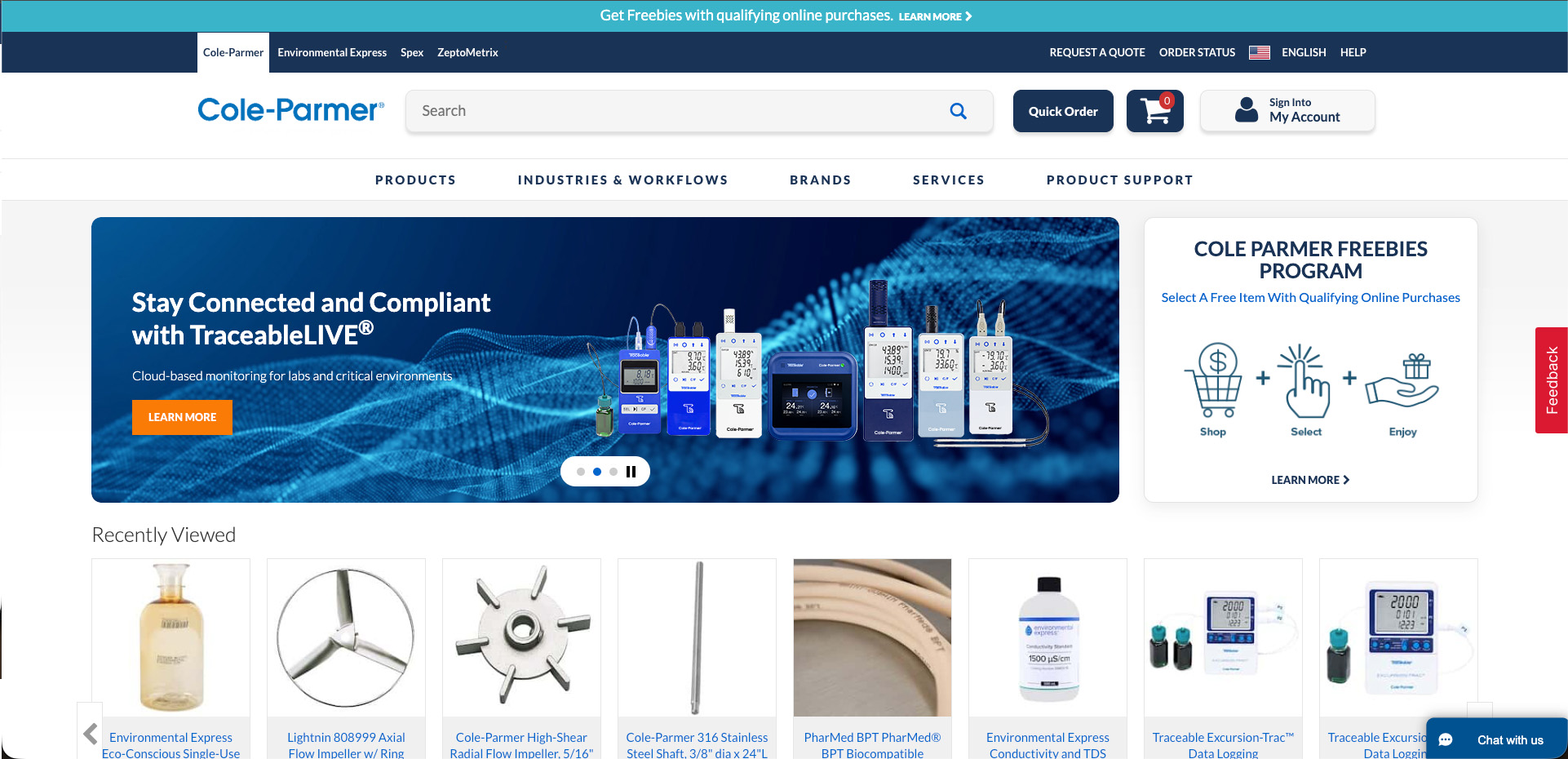
The hero was fully redesigned with stronger visuals and clearer, more direct messaging to immediately communicate the company's value to a B2B audience. Three sub-heroes were introduced beneath the primary hero to expand the marketing content available above the fold, giving the team significantly more real estate to promote campaigns, product categories, and key initiatives without competing for a single hero slot
The layout was restructured to establish a more intuitive hierarchy, giving users a clear sense of where to look and where to go next. CTA placement and visibility were significantly improved to reduce friction and better support conversion from the moment a user lands on the page. A recently viewed scroller was also added above the fold, allowing returning users to quickly pick up where they left off and reducing the effort required to re-engage with products they had already shown interest in.
Mid-Page Enhancements
Below the fold, the content was reorganized into cleaner, more purposeful sections that improved the overall flow and scannability of the page. The previous structure offered little flexibility and failed to represent the full breadth of what the company offers.
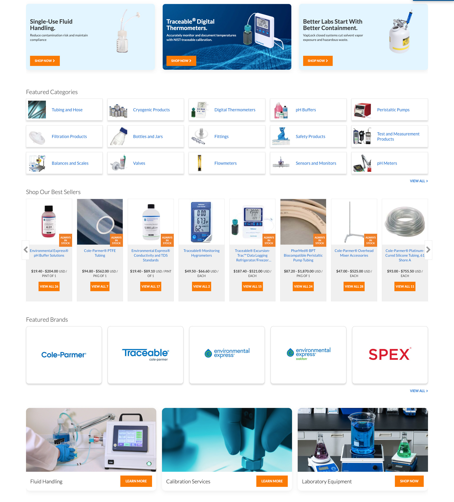
The featured categories section was expanded from 5 to 15, giving users significantly more entry points into the product catalog directly from the homepage. Rather than funneling all visitors through a narrow set of categories, the expanded selection better reflects the scale of the catalog and supports a wider range of user intents from the very first interaction. A featured brands section was also introduced, allowing users to navigate by brand.
The best sellers section was expanded from 5 to 8 products and converted into a scroller, allowing more top-performing products to be surfaced without consuming additional vertical space on the page. This gave high-intent users faster access to the catalog's most popular items while keeping the layout clean and efficient.
A flexible content area gave the marketing team a dedicated space to surface timely promotions, seasonal campaigns, and priority messaging without requiring development involvement for every update.
Bottom of The Page
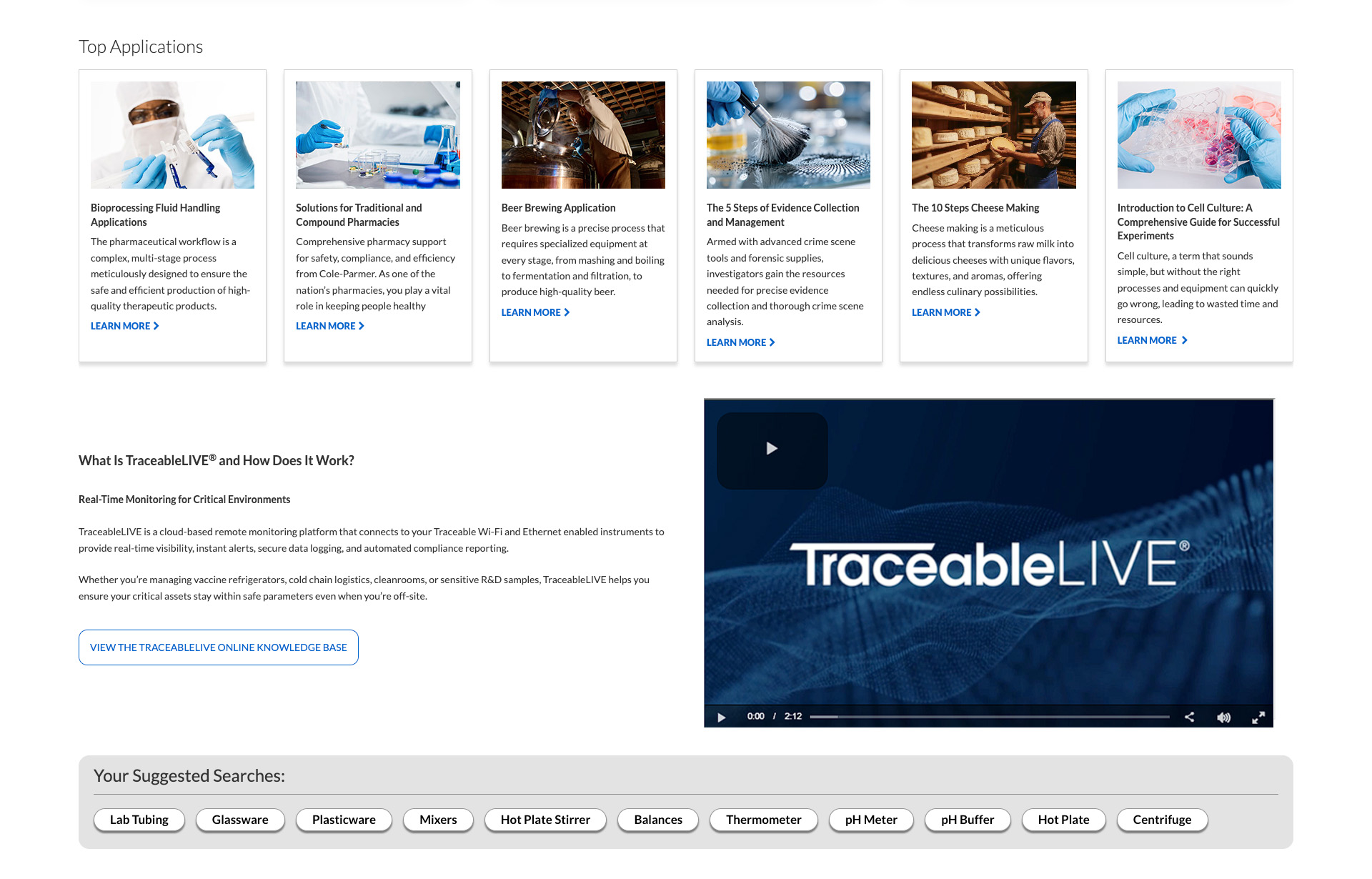
At the bottom of the page, a Top Applications section was introduced to help users explore products through the lens of how they intend to use them, supporting discovery for buyers who may not know exactly what they are looking for by name. This was particularly valuable for a B2B audience where purchasing decisions are often driven by a specific application or use case rather than a product name.
An About the Company section featuring a video was also added to give the homepage a stronger sense of credibility and scale. For a B2B audience evaluating whether to trust a supplier, this kind of content plays a meaningful role in building confidence and reinforcing the company's authority within the industry.
A Top Searches section rounded out the page, surfacing the most common search queries directly on the homepage and reducing navigation friction for users who already knew what they were looking for.
The Development Work
The final design was implemented directly into production using HTML, CSS, and JavaScript, with a strong emphasis on preserving the hierarchy, messaging, and interaction intent established in the design phase. Technical decisions were evaluated through a user-centered lens to ensure the experience remained clear and performant..
Close collaboration with IT supported iterative refinement throughout the build, allowing layout behavior, spacing, and content details to be validated and adjusted in real time. Work was staged in a development environment prior to launch, enabling thorough alignment between design and development before the page went live. Bridging design and implementation directly reduced handoff friction, accelerated iteration, and ensured the shipped solution accurately reflected both user needs and technical realities.
Key Take Aways
This project reinforced that meaningful UX improvements are often as much about surfacing the right evidence as they are about design execution. Behavioral data and competitive analysis made the problems undeniable, which created the organizational momentum needed to finally address a homepage that had gone unchanged for nearly a decade.
Grounding design decisions in research and presenting clearly to leadership aligned stakeholders early and kept the project moving despite a tight timeline. Having a shared understanding of the problem made it significantly easier to gain buy-in on solutions.
Working directly within development constraints highlighted the value of bridging design and engineering. Being involved in the build reduced friction, minimized misinterpretation, and produced a final experience that closely matched the intended design.
Check Out Some More Of My Work

Optimizing Enterprise Navigation & Search
Redesigned enterprise navigation and search to improve usability, account visibility, and product discovery.
C-PRISM
Cole-Parmer Resource for Interface & System Management
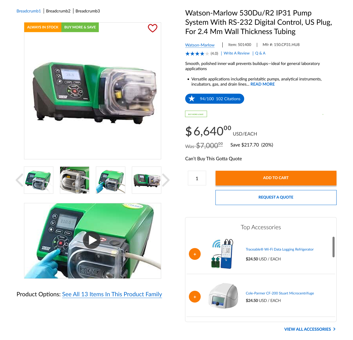
B2B Product Page Redesign
Restructured key product information to support faster decision-making and a more intuitive buying experience.
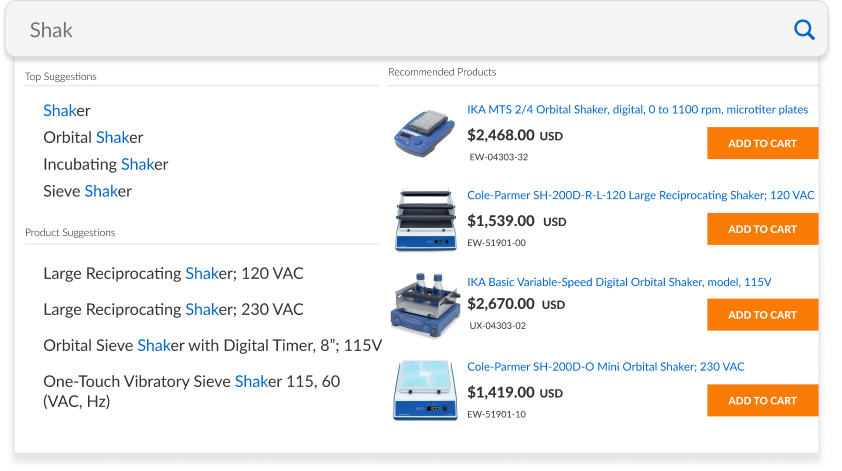
Visual Search for Complex Catalogs
Created a streamlined visual search flow for navigating large, high-SKU catalogs.
Homepage Redesign
Modernized a legacy homepage to improve clarity, visual hierarchy, and conversion performance for a high-traffic B2B website.

Augmented Reality Interface for NASA
Developed an AR interface prototype for the NASA SUITS competition.